Showing posts with label Data Science. Show all posts

Sunday 5 May 2024

Donut Charts using Python


Code:

import matplotlib.pyplot as plt

# Data to plot
labels = ['A', 'B', 'C', 'D']
sizes = [15, 30, 45, 10]

# Plot
plt.pie(sizes, labels=labels, autopct='%1.1f%%', startangle=140)

# Draw a circle at the center of pie to make it look like a donut
centre_circle = plt.Circle((0,0),0.70,fc='white')
fig = plt.gcf()
fig.gca().add_artist(centre_circle)

# Equal aspect ratio ensures that pie is drawn as a circle
plt.axis('equal')

plt.title('Basic Donut Chart')
plt.show()

#clcoding.com

Explanation:


In this code snippet, we're using the matplotlib.pyplot module, which is a powerful library in Python for creating static, animated, and interactive visualizations. We're importing it using the alias plt, which is a common convention for brevity.

Here's a breakdown of the code:

Importing matplotlib.pyplot: import matplotlib.pyplot as plt
This line imports the matplotlib.pyplot module and assigns it the alias plt, allowing us to reference it with the shorter name plt throughout the code.

labels = ['A', 'B', 'C', 'D']
sizes = [15, 30, 45, 10]
These lines define the data we want to visualize. labels contains the labels for each segment of the pie chart, and sizes contains the corresponding sizes or values for each segment.
Plotting the pie chart:

plt.pie(sizes, labels=labels, autopct='%1.1f%%', startangle=140)
Here, we use the plt.pie() function to create a pie chart. We pass sizes as the data to plot, labels to label each segment, autopct='%1.1f%%' to display the percentage for each segment, and startangle=140 to rotate the pie chart to start from the angle 140 degrees.
Drawing a circle to create a donut effect:

centre_circle = plt.Circle((0,0),0.70,fc='white')
fig = plt.gcf()
fig.gca().add_artist(centre_circle)
These lines draw a white circle at the center of the pie chart, creating a donut-like appearance. The plt.Circle() function creates a circle with the specified parameters: center (0,0) and radius 0.70.
Setting equal aspect ratio:

plt.axis('equal')
This line ensures that the plot is displayed with equal aspect ratio, so the pie chart appears as a circle rather than an ellipse.
Adding a title and displaying the plot:

plt.title('Basic Donut Chart')
plt.show()
Here, we set the title of the plot to 'Basic Donut Chart' using plt.title(), and then plt.show() displays the plot on the screen.
This code generates a basic donut chart with four segments labeled A, B, C, and D, where the size of each segment is determined by the values in the sizes list.


Code:

import matplotlib.pyplot as plt

# Data to plot
labels = ['A', 'B', 'C', 'D']
sizes = [15, 30, 45, 10]
explode = (0, 0.1, 0, 0)  # only "explode" the 2nd slice

# Plot
plt.pie(sizes, explode=explode, labels=labels, autopct='%1.1f%%', startangle=140)

# Draw a circle at the center of pie to make it look like a donut
centre_circle = plt.Circle((0,0),0.70,fc='white')
fig = plt.gcf()
fig.gca().add_artist(centre_circle)

# Equal aspect ratio ensures that pie is drawn as a circle
plt.axis('equal')

plt.title('Donut Chart with Exploded Slices')
plt.show()

#clcoding.com

Explanation: 

This code snippet is similar to the previous one, but it adds exploding effect to one of the slices in the pie chart. Let's break down the code:

Importing matplotlib.pyplot:

import matplotlib.pyplot as plt
This line imports the matplotlib.pyplot module and assigns it the alias plt, allowing us to reference it with the shorter name plt throughout the code.
Data to plot:

labels = ['A', 'B', 'C', 'D']
sizes = [15, 30, 45, 10]
explode = (0, 0.1, 0, 0)  # only "explode" the 2nd slice
Here, labels contains the labels for each segment of the pie chart, sizes contains the corresponding sizes or values for each segment, and explode contains the magnitude of the explosion for each slice. In this case, we're exploding the second slice ('B') by 0.1.
Plotting the pie chart:

plt.pie(sizes, explode=explode, labels=labels, autopct='%1.1f%%', startangle=140)
This line creates a pie chart using plt.pie(). The explode parameter is used to specify the amount by which to explode each slice. Here, we're exploding only the second slice ('B') by 0.1. Other parameters are similar to the previous example.
Drawing a circle to create a donut effect:

centre_circle = plt.Circle((0,0),0.70,fc='white')
fig = plt.gcf()
fig.gca().add_artist(centre_circle)
This part is the same as before. It draws a white circle at the center of the pie chart, creating a donut-like appearance.
Setting equal aspect ratio:

plt.axis('equal')
This line ensures that the plot is displayed with an equal aspect ratio, so the pie chart appears as a circle.
Adding a title and displaying the plot:

plt.title('Donut Chart with Exploded Slices')
plt.show()
Here, we set the title of the plot to 'Donut Chart with Exploded Slices' and then display the plot.
This code generates a donut chart with four segments labeled A, B, C, and D, where the second slice ('B') is exploded outwards. The size of each segment is determined by the values in the sizes list.


Code:

import matplotlib.pyplot as plt

# Data to plot
labels = ['A', 'B', 'C', 'D']
sizes1 = [25, 30, 35, 10]
sizes2 = [20, 40, 20, 20]

# Plot
fig, ax = plt.subplots()
ax.pie(sizes1, radius=1.2, labels=labels, autopct='%1.1f%%', startangle=140)
ax.pie(sizes2, radius=1, startangle=140, colors=['red', 'green', 'blue', 'yellow'])

# Draw a circle at the center of pie to make it look like a donut
centre_circle = plt.Circle((0,0),0.8,fc='white')
fig = plt.gcf()
fig.gca().add_artist(centre_circle)

# Equal aspect ratio ensures that pie is drawn as a circle
ax.set(aspect="equal")
plt.title('Donut Chart with Multiple Rings')
plt.show()

#clcoding.com

Explanation: 

This code snippet creates a donut chart with multiple rings, demonstrating the capability to display more than one dataset in the same chart. Let's dissect the code:

Importing matplotlib.pyplot:

import matplotlib.pyplot as plt
This line imports the matplotlib.pyplot module and assigns it the alias plt.
Data to plot:

labels = ['A', 'B', 'C', 'D']
sizes1 = [25, 30, 35, 10]
sizes2 = [20, 40, 20, 20]
Two sets of data are defined here: sizes1 and sizes2. Each set represents the values for different rings of the donut chart.
Plotting the donut chart:

fig, ax = plt.subplots()
ax.pie(sizes1, radius=1.2, labels=labels, autopct='%1.1f%%', startangle=140)
ax.pie(sizes2, radius=1, startangle=140, colors=['red', 'green', 'blue', 'yellow'])
This code creates a subplot (fig, ax = plt.subplots()) and then plots two pie charts on the same subplot using ax.pie().
The first ax.pie() call plots the outer ring (sizes1) with a larger radius (radius=1.2), while the second call plots the inner ring (sizes2) with a smaller radius (radius=1).
labels, autopct, and startangle parameters are used to configure the appearance of the pie charts.
Different colors are specified for the inner ring using the colors parameter.
Drawing a circle to create a donut effect:

centre_circle = plt.Circle((0,0),0.8,fc='white')
fig = plt.gcf()
fig.gca().add_artist(centre_circle)
This part is similar to previous examples. It draws a white circle at the center of the pie chart to create the donut-like appearance.
Setting equal aspect ratio:

ax.set(aspect="equal")
This line sets the aspect ratio of the subplot to 'equal', ensuring that the pie charts are displayed as circles.
Adding a title and displaying the plot:

plt.title('Donut Chart with Multiple Rings')
plt.show()
Finally, the title of the plot is set to 'Donut Chart with Multiple Rings', and the plot is displayed.
This code generates a donut chart with two rings, each representing different datasets (sizes1 and sizes2). Each ring has its own set of labels and colors, and they are displayed concentrically to create the donut chart effect.


Saturday 4 May 2024

Data Science: The Hard Parts: Techniques for Excelling at Data Science


This practical guide provides a collection of techniques and best practices that are generally overlooked in most data engineering and data science pedagogy. A common misconception is that great data scientists are experts in the "big themes" of the discipline—machine learning and programming. But most of the time, these tools can only take us so far. In practice, the smaller tools and skills really separate a great data scientist from a not-so-great one.

Taken as a whole, the lessons in this book make the difference between an average data scientist candidate and a qualified data scientist working in the field. Author Daniel Vaughan has collected, extended, and used these skills to create value and train data scientists from different companies and industries.

With this book, you will:

Understand how data science creates value

Deliver compelling narratives to sell your data science project

Build a business case using unit economics principles

Create new features for a ML model using storytelling

Learn how to decompose KPIs

Perform growth decompositions to find root causes for changes in a metric

Daniel Vaughan is head of data at Clip, the leading paytech company in Mexico. He's the author of Analytical Skills for AI and Data Science (O'Reilly).

PDF: Data Science: The Hard Parts: Techniques for Excelling at Data Science


Hard Copy: Data Science: The Hard Parts: Techniques for Excelling at Data Science


Streamgraphs using Python


Code:

import matplotlib.pyplot as plt

import numpy as np


x = np.linspace(0, 10, 100)

y1 = np.sin(x)

y2 = np.cos(x)


plt.stackplot(x, y1, y2, baseline='wiggle')

plt.title('Streamgraph')

plt.show()

Explanation: 

This code snippet creates a streamgraph using Matplotlib, a popular plotting library in Python. Let's break down the code:

Importing Libraries:

import matplotlib.pyplot as plt
import numpy as np
matplotlib.pyplot as plt: This imports the pyplot module of Matplotlib and assigns it the alias plt, which is a common convention.
numpy as np: This imports the NumPy library and assigns it the alias np. NumPy is commonly used for numerical computing in Python.
Generating Data:

x = np.linspace(0, 10, 100)
y1 = np.sin(x)
y2 = np.cos(x)
np.linspace(0, 10, 100): This creates an array x of 100 evenly spaced numbers between 0 and 10.
np.sin(x): This calculates the sine of each value in x, resulting in an array y1.
np.cos(x): This calculates the cosine of each value in x, resulting in an array y2.
Creating the Streamgraph:

plt.stackplot(x, y1, y2, baseline='wiggle')
plt.stackplot(x, y1, y2, baseline='wiggle'): This function creates a stack plot (streamgraph) with the x-values from x and the y-values from y1 and y2. The baseline='wiggle' argument specifies that the baseline for the stacked areas should be wiggled, which can help to visually separate the layers in the streamgraph.
Setting Title:

plt.title('Streamgraph')
plt.title('Streamgraph'): This sets the title of the plot to "Streamgraph".
Displaying the Plot:

plt.show()
plt.show(): This command displays the plot on the screen. Without this command, the plot would not be shown.
Overall, the code generates a streamgraph showing the variations of sine and cosine functions over the range of 0 to 10. The streamgraph visually represents how these functions change over the given range, with the wiggled baseline helping to distinguish between the layers.

Statistical Inference and Probability


An experienced author in the field of data analytics and statistics, John Macinnes has produced a straight-forward text that breaks down the complex topic of inferential statistics with accessible language and detailed examples. It covers a range of topics, including:

·       Probability and Sampling distributions

·       Inference and regression

·       Power, effect size and inverse probability

Part of The SAGE Quantitative Research Kit, this book will give you the know-how and confidence needed to succeed on your quantitative research journey.

Hard Copy: Statistical Inference and Probability


PDF: Statistical Inference and Probability (The SAGE Quantitative Research Kit)

Friday 26 April 2024

Top 4 free Mathematics course for Data Science !


In the age of big data, understanding statistics and data science concepts is becoming increasingly crucial across various industries. From finance to healthcare, businesses are leveraging data-driven insights to make informed decisions and gain a competitive edge. In this blog post, we'll embark on a journey through fundamental statistical concepts, explore the powerful technique of K-Means Clustering in Python, delve into the realm of probability, and demystify practical time series analysis.

In our tutorial, we'll walk through the implementation of K-Means clustering using Python, focusing on the following steps:

Understanding the intuition behind K-Means clustering.
Preprocessing the data and feature scaling.
Choosing the optimal number of clusters using techniques like the Elbow Method or Silhouette Score.
Implementing K-Means clustering using scikit-learn.
Visualizing the clustering results to gain insights into the underlying structure of the data.


Probability theory is the mathematical framework for analyzing random phenomena and quantifying uncertainty. Whether you're predicting the outcome of a coin toss or estimating the likelihood of a stock market event, probability theory provides the tools to make informed decisions in the face of uncertainty.

In this section, we'll provide an intuitive introduction to probability, covering essential concepts such as:

Basic probability terminology: events, sample space, and outcomes.
Probability axioms and rules: addition rule, multiplication rule, and conditional probability.
Probability distributions: discrete and continuous distributions.
Common probability distributions: Bernoulli, binomial, normal, and Poisson distributions.
Applications of probability theory in real-world scenarios.


Time series analysis is a crucial technique for analyzing data points collected over time and extracting meaningful insights to make forecasts and predictions. From stock prices to weather patterns, time series data is ubiquitous in various domains.

In our practical guide to time series analysis, we'll cover the following topics:

Introduction to time series data: components, trends, seasonality, and noise.
Preprocessing time series data: handling missing values, detrending, and deseasonalizing.
Exploratory data analysis (EDA) techniques for time series data visualization.
Time series forecasting methods: moving averages, exponential smoothing, and ARIMA models.
Implementing time series analysis in Python using libraries like pandas, statsmodels, and matplotlib.


Practical Time Series Analysis


There are 6 modules in this course

Welcome to Practical Time Series Analysis!

Many of us are "accidental" data analysts. We trained in the sciences, business, or engineering and then found ourselves confronted with data for which we have no formal analytic training.  This course is designed for people with some technical competencies who would like more than a "cookbook" approach, but who still need to concentrate on the routine sorts of presentation and analysis that deepen the understanding of our professional topics. 

In practical Time Series Analysis we look at data sets that represent sequential information, such as stock prices, annual rainfall, sunspot activity, the price of agricultural products, and more.  We look at several mathematical models that might be used to describe the processes which generate these types of data. We also look at graphical representations that provide insights into our data. Finally, we also learn how to make forecasts that say intelligent things about what we might expect in the future.

Please take a few minutes to explore the course site. You will find video lectures with supporting written materials as well as quizzes to help emphasize important points. The language for the course is R, a free implementation of the S language. It is a professional environment and fairly easy to learn.

You can discuss material from the course with your fellow learners. Please take a moment to introduce yourself!

Join Free: Practical Time Series Analysis

Time Series Analysis can take effort to learn- we have tried to present those ideas that are "mission critical" in a way where you understand enough of the math to fell satisfied while also being immediately productive. We hope you enjoy the class!

Thursday 18 April 2024

Meta Data Analyst Professional Certificate


Why Take a Meta Data Analyst Professional Certificate? 

Collect, clean, sort, evaluate, and visualize data

Apply the Obtain, Sort, Explore, Model, Interpret (OSEMN) framework to guide the data analysis process

Learn to use statistical analysis, including hypothesis testing, regression analysis, and more, to make data-driven decisions

Develop an understanding of the foundational principles underpinning effective data management and usability of data assets within organizational context

Aquire the confidence to add the following skills to add to your resume: 

Data analysis

Python Programming

Statistics

Data management

Data-driven decision making

Data visualization

Linear Regression

Hypothesis testing

Data Management

Tableau

Join Free: Meta Data Analyst Professional Certificate

What you'll learn

Collect, clean, sort, evaluate, and visualize data

Apply the OSEMN, framework to guide the data analysis process, ensuring a comprehensive and structured approach to deriving actionable insights

Use statistical analysis, including hypothesis testing, regression analysis, and more, to make data-driven decisions

Develop an understanding of the foundational principles of effective data management and usability of data assets within organizational context

Professional Certificate - 5 course series

Prepare for a career in the high-growth field of data analytics. In this program, you’ll build in-demand technical skills like Python, Statistics, and SQL in spreadsheets to get job-ready in 5 months or less, no prior experience needed.

Data analysis involves collecting, processing, and analyzing data to extract insights that can inform decision-making and strategy across an organization.

In this program, you’ll learn basic data analysis principles, how data informs decisions, and how to apply the OSEMN framework to approach common analytics questions. You’ll also learn how to use essential tools like SQL, Python, and Tableau to collect, connect, visualize, and analyze relevant data.

You’ll learn how to apply common statistical methods to writing hypotheses through project scenarios to gain practical experience with designing experiments and analyzing results. 

When you complete this full program, you’ll have a portfolio of hands-on projects and a Professional Certificate from Meta to showcase your expertise. 

Applied Learning Project

Throughout the program, you’ll get to practice your new data analysis skills through hands-on projects including: 

Identifying data sources

Using spreadsheets to clean and filter data

Using Python to sort and explore data

Using Tableau to visualize results

Using statistical analyses

By the end, you’ll have a professional portfolio that you can show to prospective employers or utilize for your own business.

Tuesday 16 April 2024

do you know difference between Data Analyst , Data Scientist and Data Engineer?


Data Analyst

A data analyst sits between business intelligence and data science. They provide vital information to business stakeholders.

Data Management in SQL (PostgreSQL)

Data Analysis in SQL (PostgreSQL)

Exploratory Analysis Theory

Statistical Experimentation Theory

Free Certification : Data Analyst Certification 

Data Scientist Associate 

A data scientist is a professional responsible for collecting, analyzing and interpreting extremely large amounts of data.

R / Python Programming

Data Manipulation in R/Python

1.1 Calculate metrics to effectively report characteristics of data and relationships between

features

● Calculate measures of center (e.g. mean, median, mode) for variables using R or Python.

● Calculate measures of spread (e.g. range, standard deviation, variance) for variables

using R or Python.

● Calculate skewness for variables using R or Python.

● Calculate missingness for variables and explain its influence on reporting characteristics

of data and relationships in R or Python.

● Calculate the correlation between variables using R or Python.

1.2 Create data visualizations in coding language to demonstrate the characteristics of data

● Create and customize bar charts using R or Python.

● Create and customize box plots using R or Python.

● Create and customize line graphs using R or Python.

● Create and customize histograms graph using R or Python.

1.3 Create data visualizations in coding language to represent the relationships between

features

● Create and customize scatterplots using R or Python.

● Create and customize heatmaps using R or Python.

● Create and customize pivot tables using R or Python.

1.4 Identify and reduce the impact of characteristics of data

● Identify when imputation methods should be used and implement them to reduce the

impact of missing data on analysis or modeling using R or Python.

● Describe when a transformation to a variable is required and implement corresponding

transformations using R or Python.

● Describe the differences between types of missingness and identify relevant approaches

to handling types of missingness.

● Identify and handle outliers using R or Python.

Statistical Fundamentals in R/Python

2.1 Perform standard data import, joining and aggregation tasks

● Import data from flat files into R or Python.

● Import data from databases into R or Python

● Aggregate numeric, categorical variables and dates by groups using R or Python.

● Combine multiple tables by rows or columns using R or Python.

● Filter data based on different criteria using R or Python.

2.2 Perform standard cleaning tasks to prepare data for analysis

● Match strings in a dataset with specific patterns using R or Python.

● Convert values between data types in R or Python.

● Clean categorical and text data by manipulating strings in R or Python.

● Clean date and time data in R or Python.

2.3 Assess data quality and perform validation tasks

● Identify and replace missing values using R or Python.

● Perform different types of data validation tasks (e.g. consistency, constraints, range

validation, uniqueness) using R or Python.

● Identify and validate data types in a data set using R or Python.

2.4 Collect data from non-standard formats by modifying existing code

● Adapt provided code to import data from an API using R or Python.

● Identify the structure of HTML and JSON data and parse them into a usable format for

data processing and analysis using R or Python

Importing & Cleaning in R/Python

3.1 Prepare data for modeling by implementing relevant transformations.
● Create new features from existing data (e.g. categories from continuous data, combining
variables with external data) using R or Python.
● Explain the importance of splitting data and split data for training, testing, and validation
using R or Python.
● Explain the importance of scaling data and implement scaling methods using R or Python.
● Transform categorical data for modeling using R or Python.
3.2 Implement standard modeling approaches for supervised learning problems.
● Identify regression problems and implement models using R or Python.
● Identify classification problems and implement models using R or Python.
3.3 Implement approaches for unsupervised learning problems.
● Identify clustering problems and implement approaches for them using R or Python.
● Explain dimensionality reduction techniques and implement the techniques using R or
Python.
3.4 Use suitable methods to assess the performance of a model.
● Select metrics to evaluate regression models and calculate the metrics using R or Python.
● Select metrics to evaluate classification models and calculate the metrics using R or
Python.
● Select metrics and visualizations to evaluate clustering models and implement them
using R or Python.

Machine Learning Fundamentals in R/Python

4.2 Demonstrates best practices in production code including version control, testing, and
package development.
● Describe the basic flow and structures of package development in R or Python.
● Explain how to document code in packages, or modules in R or Python.
● Explain the importance of the testing and write testing statements in R or Python.
● Explain the importance of version control and describe key concepts of versioning

Free Certification : Data Science  

Data Engineer

A data engineer collects, stores, and pre-processes data for easy access and use within an organization. Associate certification is available.

Data Management in SQL (PostgreSQL)

Exploratory Analysis Theory

Free Certification : Data Science  

Sunday 14 April 2024

4 Free books to master Data Analytics

 Storytelling with Data: A Data Visualization Guide for Business Professionals  


Don't simply show your data - tell a story with it!

Storytelling with Data teaches you the fundamentals of data visualization and how to communicate effectively with data. You'll discover the power of storytelling and the way to make data a pivotal point in your story. The lessons in this illuminative text are grounded in theory but made accessible through numerous real-world examples - ready for immediate application to your next graph or presentation.

Storytelling is not an inherent skill, especially when it comes to data visualization, and the tools at our disposal don't make it any easier. This book demonstrates how to go beyond conventional tools to reach the root of your data and how to use your data to create an engaging, informative, compelling story. Specifically, you'll learn how to:

Understand the importance of context and audience

Determine the appropriate type of graph for your situation

Recognize and eliminate the clutter clouding your information

Direct your audience's attention to the most important parts of your data

Think like a designer and utilize concepts of design in data visualization

Leverage the power of storytelling to help your message resonate with your audience

Together, the lessons in this book will help you turn your data into high-impact visual stories that stick with your audience. Rid your world of ineffective graphs, one exploding 3D pie chart at a time. There is a story in your data - Storytelling with Data will give you the skills and power to tell it!


Fundamentals of Data Analytics: Learn Essential Skills, Embrace the Future, and Catapult Your Career in the Data-Driven World—A Comprehensive Guide to Data Literacy for Beginners

Gain a competitive edge in today’s data-driven world and build a rich career as a data professional that drives business success and innovation…

Today, data is everywhere… and it has become the essential building block of this modern society.

And that’s why now is the perfect time to pursue a career in data.

But what does it take to become a competent data professional?

This book is your ultimate guide to understanding the fundamentals of data analytics, helping you unlock the expertise of efficiently solving real-world data-related problems.

Here is just a fraction of what you will discover:

A beginner-friendly 5-step framework to kickstart your journey into analyzing and processing data

How to get started with the fundamental concepts, theories, and models for accurately analyzing data

Everything you ever needed to know about data mining and machine learning principles

Why business run on a data-driven culture, and how you can leverage it using real-time business intelligence analytics

Strategies and techniques to build a problem-solving mindset that can overcome any complex and unique dataset

How to create compelling and dynamic visualizations that help generate insights and make data-driven decisions

The 4 pillars of a new digital world that will transform the landscape of analyzing data

And much more.

Believe it or not, you can be terrible in math or statistics and still pursue a career in data.

And this book is here to guide you throughout this journey, so that crunching data becomes second nature to you.

Ready to master the fundamentals and build a successful career in data analytics? Click the “Add to Cart” button right now.

PLEASE NOTE: When you purchase this title, the accompanying PDF will be available in your Audible Library along with the audio.

Data Analytics for Absolute Beginners: A Deconstructed Guide to Data Literacy: Python for Data Science, Book 2

Make better decisions with this easy deconstructed guide to data analytics.

Want to add data analytics to your skill stack? Having trouble finding where to start?

Cell-by-cell, bit-by-bit, this audiobook teaches you the vocabulary, tools, and basic algorithms to think like a data scientist.

Like putting together a complex Lego set, each section connects and adds individual blocks of knowledge to build your data literacy. This linear structure to unpacking data analytics takes you from zero to confidently analyzing and discussing data problems.

Who is this audiobook for? This audiobook is ideal for anyone interested in making sense of data analytics without the assumption that you understand data science terminology or advanced math. If you've tried to learn data analytics before and failed, this audiobook is for you.

Practical approach. This audiobook takes a hands-on approach to learning. This includes practical examples, visual examples, as well as two bonus coding exercises in Python, including free video content to walk you through both exercises. By the end of the audiobook, you will have the practical knowledge to tackle real data problems in your organization or daily life.

What you will learn:

How to recognize the common data types every data scientist needs to master
Where to store your data, including big data
New trends in data analytics, including what is alternative data and why not many people know about it
How to explain the distinction between data mining, machine learning, and analytics to your colleagues
When and how to use regression analysis, classification, clustering, association analysis, and natural language processing
How to make better business decisions using data visualization and business intelligence

Data Analytics, Data Visualization & Communicating Data: 3 books in 1: Learn the Processes of Data Analytics and Data Science, Create Engaging Data Visualizations, and Present Data Effectively


Harvard Business Review called data science “the sexiest job of the 21st century,” so it's no surprise that data science jobs have grown up to 20 times in the last three years. With demand outpacing supply, companies are willing to pay top dollar for talented data professionals. However, to stand out in one of these positions, having foundational knowledge of interpreting data is essential. You can be a spreadsheet guru, but without the ability to turn raw data into valuable insights, the data will render useless. That leads us to data analytics and visualization, the ability to examine data sets, draw meaningful conclusions and trends, and present those findings to the decision-maker effectively.

Mastering this skill will undoubtedly lead to better and faster business decisions. The three audiobooks in this series will cover the foundational knowledge of data analytics, data visualization, and presenting data, so you can master this essential skill in no time. This series includes:

Everything data analytics: a beginner's guide to data literacy and understanding the processes that turns data into insights.

Beginner's guide to data visualization: how to understand, design, and optimize over 40 different charts.

How to win with your data visualizations: the five part guide for junior analysts to create effective data visualizations and engaging data stories.

These three audiobooks cover an extensive amount of information, such as:

Overview of the data collection, management, and storage processes.

Fundamentals of cleaning data.

Essential machine learning algorithms required for analysis such as regression, clustering, classification, and more....

The fundamentals of data visualization.

An in-depth view of over 40 plus charts and when to use them.

A comprehensive data visualization design guide.

Walkthrough on how to present data effectively.

And so much more!

Tuesday 2 April 2024

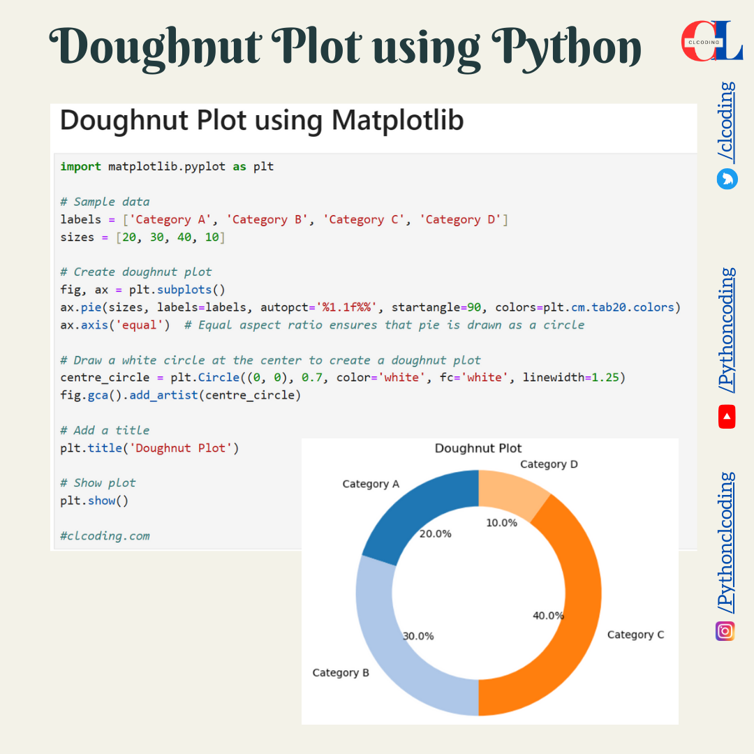
Doughnut Plot using Python


import plotly.graph_objects as go


# Sample data

labels = ['A', 'B', 'C', 'D']

values = [20, 30, 40, 10]

colors = ['#FFA07A', '#FFD700', '#6495ED', '#ADFF2F']


# Create doughnut plot

fig = go.Figure(data=[go.Pie(labels=labels, values=values, hole=.5, marker=dict(colors=colors))])

fig.update_traces(textinfo='percent+label', textfont_size=14, hoverinfo='label+percent')

fig.update_layout(title_text="Customized Doughnut Plot", showlegend=False)


# Show plot

fig.show()


#clcoding.com


import matplotlib.pyplot as plt


# Sample data

labels = ['Category A', 'Category B', 'Category C', 'Category D']

sizes = [20, 30, 40, 10]

explode = (0, 0.1, 0, 0)  # "explode" the 2nd slice


# Create doughnut plot

fig, ax = plt.subplots()

ax.pie(sizes, explode=explode, labels=labels, autopct='%1.1f%%', startangle=90, shadow=True, colors=plt.cm.tab20.colors)

ax.axis('equal')  # Equal aspect ratio ensures that pie is drawn as a circle


# Draw a white circle at the center to create a doughnut plot

centre_circle = plt.Circle((0, 0), 0.7, color='white', fc='white', linewidth=1.25)

fig.gca().add_artist(centre_circle)


# Add a title

plt.title('Doughnut Plot with Exploded Segment and Shadow Effect')


# Show plot

plt.show()


#clcoding.com


import plotly.graph_objects as go


# Sample data

labels = ['A', 'B', 'C', 'D']

values = [20, 30, 40, 10]


# Create doughnut plot

fig = go.Figure(data=[go.Pie(labels=labels, values=values, hole=.5)])

fig.update_layout(title_text="Doughnut Plot")


# Show plot

fig.show()


#clcoding.com


import matplotlib.pyplot as plt


# Sample data

labels = ['Category A', 'Category B', 'Category C', 'Category D']

sizes = [20, 30, 40, 10]


# Create doughnut plot

fig, ax = plt.subplots()

ax.pie(sizes, labels=labels, autopct='%1.1f%%', startangle=90, colors=plt.cm.tab20.colors)

ax.axis('equal')  # Equal aspect ratio ensures that pie is drawn as a circle


# Draw a white circle at the center to create a doughnut plot

centre_circle = plt.Circle((0, 0), 0.7, color='white', fc='white', linewidth=1.25)

fig.gca().add_artist(centre_circle)


# Add a title

plt.title('Doughnut Plot')


# Show plot

plt.show()


#clcoding.com

Friday 8 March 2024

Fractal Data Science Professional Certificate


What you'll learn

 Apply structured problem-solving techniques to dissect and address complex data-related challenges encountered in real-world scenarios.   

Utilize SQL proficiency to retrieve, manipulate data and employ data visualization skills using Power BI to communicate insights.

Apply Python expertise for data manipulation, analysis and implement machine learning algorithms to create predictive models for applications.

Create compelling data stories to influence your audience and master the art of critically analyzing data while making decisions and recommendations.

Join Free: Fractal Data Science Professional Certificate

Professional Certificate - 8 course series

Data science is projected to create 11.5 1 million global job openings by 2026 and offers many of the remote 2 job opportunities in the industry.

Prepare for a new career in this high-demand field with a Professional Certificate from Fractal Analytics. Whether you're a recent graduate seeking a rewarding career shift or a professional aiming to upskill, this program will equip you with the essential skills demanded by the industry.

This curriculum is designed with a problem-solving approach at the center to equip and enable you with the skills, required to solve data science problems, instead of just focusing on the tools and applications.

Through hands-on courses you'll master Python programming, harness the power of machine learning, cultivate expertise in data manipulation, and build understanding of cognitive factors affecting decisions. You will also learn the direct application of tools like SQL, PowerBI, and Python to real-world scenarios.

Upon completion, you will earn a Professional Certificate, which will help to make your profile standout in your career journey.

Fractal Data Science Professional Certificate is one of the preferred qualifications for entry-level data science jobs at Fractal. Complete this certificate to make your profile standout from other candidates while applying for job openings at Fractal.

Applied Learning Project

Learners will be able to apply structured problem-solving techniques to dissect and address complex data-related challenges encountered in real-world scenarios and utilize SQL proficiency to retrieve and manipulate data and employ data visualization skills using Power BI to communicate insights. Becoming experts at Python programming to manipulate and analyze data. Learners will implement machine learning algorithms to create predictive models for diverse applications. And create compelling data stories to influence and inform your audience and master the art of critically analyzing data while making decisions and recommendations.

CertNexus Certified Data Science Practitioner Professional Certificate


Advance your career with in-demand skills

Receive professional-level training from CertNexus

Demonstrate your technical proficiency

Earn an employer-recognized certificate from CertNexus

Prepare for an industry certification exam

Join Free: CertNexus Certified Data Science Practitioner Professional Certificate

Professional Certificate - 5 course series

The field of Data Science has topped the Linked In Emerging Jobs list for the last 3 years with a projected growth of 28% annually and the World Economic Forum lists Data Analytics and Scientists as the top emerging job for 2022. 

Data can reveal insights and inform business—by guiding decisions and influencing day-to-day operations. This specialization will teach learners how to analyze, understand, manipulate, and present data within an effective and repeatable process framework and will enable you to bring value to the business by putting data science concepts into practice. 

This course is designed for business professionals that want to learn how to more effectively extract insights from their work and leverage that insight in addressing business issues, thereby bringing greater value to the business. The typical student in this course will have several years of experience with computing technology, including some aptitude in computer programming.

Certified Data Science Practitioner (CDSP)  will prepare learners for the CertNexus CDSP certification exam. 

To complete your journey to the CDSP Certification

Complete the Coursera Certified Data Science Practitioner Professional Certificate.

Review the CDSP Exam Blueprint
.

Purchase your CDSP Exam Voucher

Register for your CDSP Exam.

Applied Learning Project

At the conclusion of each course, learners will have the opportunity to complete a project which can be added to their portfolio of work.  Projects include: 

Address a Business Issue with Data Science 

Extract, Transform, and Load Data

Data Analysis

Training a Machine Learning Model

Presenting a Data Science Project

IBM Data Engineering Professional Certificate


What you'll learn

Master the most up-to-date practical skills and knowledge data engineers use in their daily roles

Learn to create, design, & manage relational databases & apply database administration (DBA) concepts to RDBMSs such as MySQL, PostgreSQL, & IBM Db2 

Develop working knowledge of NoSQL & Big Data using MongoDB, Cassandra, Cloudant, Hadoop, Apache Spark, Spark SQL, Spark ML, and Spark Streaming 

Implement ETL & Data Pipelines with Bash, Airflow & Kafka; architect, populate, deploy Data Warehouses; create BI reports & interactive dashboards 

Join Free: IBM Data Engineering Professional Certificate

Professional Certificate - 13 course series

Prepare for a career in the high-growth field of data engineering. In this program, you’ll learn in-demand skills like Python, SQL, and Databases to get job-ready in less than 5 months.

Data engineering is building systems to gather data, process and organize raw data into usable information, and manage data. The work data engineers do provides the foundational information that data scientists and business intelligence (BI) analysts use to make recommendations and decisions.

This program will teach you the foundational data engineering skills employers are seeking for entry level data engineering roles, including Python, one of the most widely used programming languages. You’ll also master SQL, RDBMS, ETL, Data Warehousing, NoSQL, Big Data, and Spark with hands-on labs and projects.

You’ll learn to use Python programming language and Linux/UNIX shell scripts to extract, transform and load (ETL) data. You’ll also work with Relational Databases (RDBMS) and query data using SQL statements and use NoSQL databases as well as unstructured data. 

When you complete the full program, you’ll have a portfolio of projects and a Professional Certificate from IBM to showcase your expertise. You’ll also earn an IBM Digital badge and will gain access to career resources to help you in your job search, including mock interviews and resume support. 

This program is ACE® recommended—when you complete, you can earn up to 12 college credits.

Applied Learning Project

Throughout this Professional Certificate, you will complete hands-on labs and projects to help you gain practical experience with Python, SQL, relational databases, NoSQL databases, Apache Spark, building data pipelines, managing databases, and working with data warehouses.

Design a relational database to help a coffee franchise improve operations.

Use SQL to query census, crime, and school demographic data sets.

Write a Bash shell script on Linux that backups changed files.

Set up, test, and optimize a data platform that contains MySQL, PostgreSQL, and IBM Db2 databases.

Analyze road traffic data to perform ETL and create a pipeline using Airflow and Kafka.

Design and implement a data warehouse for a solid-waste management company.

Move, query, and analyze data in MongoDB, Cassandra, and Cloudant NoSQL databases.

Train a machine learning model by creating an Apache Spark application.

This program is FIBAA recommended—when you complete, you can earn up to 8 ECTS credits.

Preparing for Google Cloud Certification: Cloud Data Engineer Professional Certificate


What you'll learn

Identify the purpose and value of the key Big Data and Machine Learning products in Google Cloud.

Employ BigQuery to carry out interactive data analysis.

Use Cloud SQL and Dataproc to migrate existing MySQL and Hadoop/Pig/Spark/Hive workloads to Google Cloud.

Choose between different data processing products on Google Cloud.

Join Free: Preparing for Google Cloud Certification: Cloud Data Engineer Professional Certificate 

Professional Certificate - 6 course series

Google Cloud Professional Data Engineer certification was ranked #1 
on Global Knowledge's list of 15 top-paying certifications in 2021
! Enroll now to prepare!

---

87% of Google Cloud certified users feel more confident in their cloud skills. This program provides the skills you need to advance your career and provides training to support your preparation for the industry-recognized
 Google Cloud Professional Data Engineer
 certification.

Here's what you have to do

1) Complete the Coursera Data Engineering Professional Certificate

2) Review other recommended resources for the Google Cloud Professional Data Engineer certification
 exam

3) Review the Professional Data Engineer exam guide

4) Complete Professional Data Engineer sample questions

5)Register for the Google Cloud certification exam (remotely or at a test center)

Applied Learning Project

This professional certificate incorporates hands-on labs using Qwiklabs platform.These hands on components will let you apply the skills you learn. Projects incorporate Google Cloud Platform products used within Qwiklabs. You will gain practical hands-on experience with the concepts explained throughout the modules.

Applied Learning Project

 This Professional Certificate incorporates hands-on labs using our Qwiklabs platform.

These hands on components will let you apply the skills you learn in the video lectures. Projects will incorporate topics such as Google BigQuery, which are used and configured within Qwiklabs. You can expect to gain practical hands-on experience with the concepts explained throughout the modules.

Tableau Business Intelligence Analyst Professional Certificate


What you'll learn

Gain the essential skills necessary to excel in an entry-level Business Intelligence Analytics role.

Learn to use Tableau Public to manipulate and prepare data for analysis.

Craft and dissect data visualizations that reveal patterns and drive actionable insights.

Construct captivating narratives through data, enabling stakeholders to explore insights effectively.

Join Free: Tableau Business Intelligence Analyst Professional Certificate

Professional Certificate - 8 course series

Whether you are just starting out or looking for a career change, the Tableau Business Intelligence Analytics Professional Certificate will prepare you for entry-level roles that require fundamental Tableau skills, such as business intelligence analyst roles. If you are detail-oriented and have an interest in looking for trends in data, this program is for you. Through hands-on, real-world scenarios, you learn how to use the Tableau platform to evaluate data to generate and present actionable business insights. Upon completion, you will be prepared to take the 
Tableau Desktop Specialist Exam
.  With this certification, you will be qualified to apply for a position in the business intelligence analyst field.  

In this program, you’ll: 

 Craft problem statements, business requirement documents, and visual models.

 Connect with various data sources and preprocess data in Tableau for enhanced quality and analysis.

 Learn to utilize the benefits of Tableau’s analytics features for efficient reporting.

Learn to create advanced and spatial analytics data visualizations by integrating motion and multi-layer elements to effectively communicate insights to stakeholders.

Employ data storytelling principles and design techniques to craft compelling presentations that empower you to extract meaningful insights.

This program was developed by Tableau experts, designed to prepare you for a career in Business Intelligence Analytics and help you learn the most relevant skills.

Applied Learning Project

 Throughout the program, you’ll engage in applied learning through hands-on activities to help level up your knowledge. Each course contains ungraded quizzes throughout the content, a graded quiz at the end of each module, and a variety of hands-on projects. The program activities will give you the skills to : 

Preprocess, manage, and manipulate data for analysis using Tableau. 

Create and customize Visualizations in Tableau. 

Learn best practices for creating presentations to communicate data analysis insights to stakeholders. 

Wednesday 6 March 2024

Data Analysis and Visualization Foundations Specialization


What you'll learn

Describe the data ecosystem, tasks a Data Analyst performs, as well as skills and tools required for successful data analysis

Explain basic functionality of spreadsheets and utilize Excel to perform a variety of data analysis tasks like data wrangling and data mining

List various types of charts and plots and create them in Excel as well as work with Cognos Analytics to generate interactive dashboards

Join Free: Data Analysis and Visualization Foundations Specialization

Specialization - 4 course series

Deriving insights from data and communicating findings has become an increasingly important part of virtually every profession. This Specialization prepares you for this data-driven transformation by teaching you the core principles of data analysis and visualization and by giving you the tools and hands-on practice to communicate the results of your data discoveries effectively.  

You will be introduced to the modern data ecosystem. You will learn the skills required to successfully start data analysis tasks by becoming familiar with spreadsheets like Excel. You will examine different data sets, load them into the spreadsheet, and employ techniques like summarization, sorting, filtering, & creating pivot tables.

Creating stunning visualizations is a critical part of communicating your data analysis results. You will use Excel spreadsheets to create the many different types of data visualizations such as line plots, bar charts, pie charts. You will also create advanced visualizations such as treemaps, scatter charts & map charts. You will then build interactive dashboards. 

This Specialization is designed for learners interested in starting a career in the field of Data or Business Analytics, as well as those in other professions, who need basic data analysis and visualization skills to supplement their primary job tasks.

This program is ACE® recommended—when you complete, you can earn up to 9 college credits.  

Applied Learning Project

Build your data analytics portfolio as you gain practical experience from producing artifacts in the interactive labs and projects throughout this program. Each course has a culminating project to apply your newfound skills:

In the first course, create visualizations to detect fraud by analyzing credit card data.

In the second course, import, clean, and analyze fleet vehicle inventory with Excel pivot tables.

In the third course, use car sales key performance indicator (KPI) data to create an interactive dashboard with stunning visualizations using Excel and IBM Cognos Analytics.

Only a modern web browser is required to complete these practical exercises and projects — no need to download or install anything on your device.

IBM AI Foundations for Business Specialization


Advance your subject-matter expertise

Learn in-demand skills from university and industry experts

Master a subject or tool with hands-on projects

Develop a deep understanding of key concepts

Earn a career certificate from IBM

Join Free: IBM AI Foundations for Business Specialization

Specialization - 3 course series

This specialization will explain and describe the overall focus areas for business leaders considering AI-based solutions for business challenges. The first course provides a business-oriented summary of technologies and basic concepts in AI. The second will introduce the technologies and concepts in data science. The third introduces the AI Ladder, which is a framework for understanding the work and processes that are necessary for the successful deployment of AI-based solutions.  

Applied Learning Project

Each of the courses in this specialization include Checks for Understanding, which are designed to assess each learner’s ability to understand the concepts presented as well as use those concepts in actual practice.  Specifically, those concepts are related to introductory knowledge regarding 1) artificial intelligence; 2) data science, and; 3) the AI Ladder.  

IBM & Darden Digital Strategy Specialization


What you'll learn

Understand the value of data and how the rapid growth of technologies such as artificial intelligence and cloud computing are transforming business. 

Join Free: IBM & Darden Digital Strategy Specialization

Specialization - 6 course series

This Specialization was designed to combine the most current business research in digital transformation and strategy with the most up-to-date technical knowledge of the technologies that are changing how we work and do business to enable you to advance your career. By the end of this Specialization, you will have an understanding of the three technologies impacting all businesses: artificial intelligence, cloud computing, and data science. You will also be able to develop or advance a digital transformation strategy for your own business using these technologies. This specialization will help managers understand technology and technical workers to understand strategy, and is ideal for anyone who wants to be able to help lead projects in digital transformation and technical and business strategy.

Applied Learning Project

This Specialization was designed to combine the most current business research in digital transformation and strategy with the most up-to-date technical knowledge of the technologies that are changing how we work and do business to enable you to advance your career. By the end of this Specialization, you will have an understanding of the three technologies impacting all businesses: artificial intelligence, cloud computing, and data science. You will also be able to develop or advance a digital transformation strategy for your own business using these technologies. This specialization will help managers understand technology and technical workers to understand strategy, and is ideal for anyone who wants to be able to help lead projects in digital transformation and technical and business strategy.

Data Science Fundamentals with Python and SQL Specialization


What you'll learn

Working knowledge of Data Science Tools such as Jupyter Notebooks, R Studio, GitHub, Watson Studio

Python programming basics including data structures, logic, working with files, invoking APIs, and libraries such as Pandas and Numpy

Statistical Analysis techniques including  Descriptive Statistics, Data Visualization, Probability Distribution, Hypothesis Testing and Regression

Relational Database fundamentals including SQL query language, Select statements, sorting & filtering, database functions, accessing multiple tables

Join Free: Data Science Fundamentals with Python and SQL Specialization

Specialization - 5 course series

Data Science is one of the hottest professions of the decade, and the demand for data scientists who can analyze data and communicate results to inform data driven decisions has never been greater. This Specialization from IBM will help anyone interested in pursuing a career in data science by teaching them fundamental skills to get started in this in-demand field.

The specialization consists of 5 self-paced online courses that will provide you with the foundational skills required for Data Science, including open source tools and libraries, Python, Statistical Analysis, SQL, and relational databases. You’ll learn these data science pre-requisites through hands-on practice using real data science tools and real-world data sets.

Upon successfully completing these courses, you will have the practical knowledge and experience to delve deeper in Data Science and work on more advanced Data Science projects. 

No prior knowledge of computer science or programming languages required. 

This program is ACE® recommended—when you complete, you can earn up to 8 college credits.  

Applied Learning Project

All courses in the specialization contain multiple hands-on labs and assignments to help you gain practical experience and skills with a variety of data sets. Build your data science portfolio from the artifacts you produce throughout this program. Course-culminating projects include:

Extracting and graphing financial data with the Pandas data analysis Python library

Generating visualizations and conducting statistical tests to provide insight on housing trends using census data

Using SQL to query census, crime, and demographic data sets to identify causes that impact enrollment, safety, health, and environment ratings in schools

Introduction to Data Science Specialization


What you'll learn

Describe what data science and machine learning are, their applications & use cases, and various types of tasks performed by data scientists  

Gain hands-on familiarity with common data science tools including JupyterLab, R Studio, GitHub and Watson Studio 

Develop the mindset to work like a data scientist, and follow a methodology to tackle different types of data science problems

Write SQL statements and query Cloud databases using Python from Jupyter notebooks

Join Free: Introduction to Data Science Specialization

Specialization - 4 course series

Interested in learning more about data science, but don’t know where to start? This 4-course Specialization from IBM will provide you with the key foundational skills any data scientist needs to prepare you for a career in data science or further advanced learning in the field.  

This Specialization will introduce you to what data science is and what data scientists do. You’ll discover the applicability of data science across fields, and learn how data analysis can help you make data driven decisions. You’ll find that you can kickstart your career path in the field without prior knowledge of computer science or programming languages: this Specialization will give you the foundation you need for more advanced learning to support your career goals.

You’ll grasp concepts like big data, statistical analysis, and relational databases, and gain familiarity with various open source tools and data science programs used by data scientists, like Jupyter Notebooks, RStudio, GitHub, and SQL. You'll complete hands-on labs and projects to learn the methodology involved in tackling data science problems and apply your newly acquired skills and knowledge to real world data sets.

In addition to earning a Specialization completion certificate from Coursera, you’ll also receive a digital badge from IBM recognizing you as a specialist in data science foundations.

This Specialization can also be applied toward the 
IBM Data Science Professional Certificate. 

Applied Learning Project

All courses in the specialization contain multiple hands-on labs and assignments to help you gain practical experience and skills with a variety of data sets and tools like Jupyter, GitHub, and R Studio. Build your data science portfolio from the artifacts you produce throughout this program. Course-culminating projects include:

Creating and sharing a Jupyter Notebook containing code blocks and markdown

Devising a problem that can be solved by applying the data science methodology and explain how to apply each stage of the methodology to solve it

Using SQL to query census, crime, and demographic data sets to identify causes that impact enrollment, safety, health, and environment ratings in schools

Popular Posts

Categories

AI (27) Android (24) AngularJS (1) Assembly Language (2) aws (17) Azure (7) BI (10) book (4) Books (118) C (77) C# (12) C++ (82) Course (62) Coursera (180) Cybersecurity (22) data management (11) Data Science (95) Data Strucures (6) Deep Learning (9) Django (6) Downloads (3) edx (2) Engineering (14) Excel (13) Factorial (1) Finance (6) flutter (1) FPL (17) Google (19) Hadoop (3) HTML&CSS (46) IBM (25) IoT (1) IS (25) Java (92) Leet Code (4) Machine Learning (44) Meta (18) MICHIGAN (5) microsoft (4) Pandas (3) PHP (20) Projects (29) Python (753) Python Coding Challenge (232) Questions (2) R (70) React (6) Scripting (1) security (3) Selenium Webdriver (2) Software (17) SQL (40) UX Research (1) web application (8)

Followers

Person climbing a staircase. Learn Data Science from Scratch: online program with 21 courses