What is Matplotlib in Data Visualization?
Hello everyone, welcome to Python crash course. Today I am going to Explain What is Matplotlib in Data Visualization? Let's Start:
Introduction about Matplotlib:
A pictures is worth a thousand word, and with Python’s matplotlib library, it, fortunately, take far less than a thousand words of code to create a production-quality graphic.However, matplotlibs is also a massive library, and getting a plot to looks just right is often achieved through trial and error. Using one-liners to generate basic plot in matplotlib is fairly simple, but skillfully commanding the remaining 97% of the library can be daunting.
This articles is a beginner-to-intermediate-level walkthrough on matplotlib that mixe theory with example. While learning by example can be tremendously insightful, it helps to have even just a surface-level understanding of the library’s inner working and layout as well.
SOME EXAMPLE OF MATPLOTLIB:
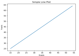
In this chapter, we will learn how to create a simple plots with Matplotlib.
We shall now display a simple line plots of angle in radians. its sine values in Matplotlib. To begin with, the Pyplot module from Matplotlib package is imported, with an alias plot as a matter of convention.
import matplotlib.pyplot as plt
Next we need an array of number to plot. Various array function are defined in the Numpy library which is imported with the np alias.
import numpy as np
We now obtain the ndarray object of angle between 0 and 2π using the arange() function from the Numpy library.
x = np.arange(0, math.pi*2, 0.05)
The ndarray object serves as values on x axis of the graphs. The corresponding sine values of angles in x to be displayed on y axis are obtained by the following statements −
y = np.sin(x)
The value from two arrays are plotted using the plot() functions.
plt.plot(x,y)
You can set the plots title, and labels for x and y axes.
#You can set the plots title, and labels for x and y axes.plt.xlabel("angle")plt.ylabel("sine")plt.title('sine wave')
The Plots viewer window is invoked by the show() function −
plt.show()
The complete programs is as follow −
from matplotlib import pyplot as pltimport numpy as npimport math #needed for definition of pix = np.arange(0, math.pi*2, 0.05)y = np.sin(x)plt.plot(x,y)plt.xlabel("angle")plt.ylabel("sine")plt.title('sine wave')plt.show()

FOR DETAILED PLEASE OPEN BELOW LINK:
BEST OF LUCK!!!!!!


.png)

.png)


.png)


0 Comments:
Post a Comment