Showing posts with label Python. Show all posts

Friday 22 May 2020

Linear Regression in python | python crash course_06

Linear Regression in Machine learning :

Welcome to machine learning in python crash course, so in this section we will learn different machine learning algorithm. Let's start:
Linear Regressions is usually the first machine learning algorithm. It is a simple model but everyone need to master it as it lays the foundation for other machine learning algorithm.

Where can Linear Regressions be used?

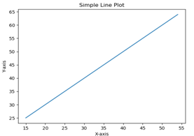
It is a very powerful techniques and can be used to understand the factors that influence profitability. It can be used to forecast sale in the coming months by analyzing the sales data for previous month. It can also be used to gain various insights into customers behaviour. By the end of the blog, we will build a model which looks like the below picture i.e, determine a line which best fit the data.
Example
In this example, we will use Pima Indian Diabetes dataset to select four of the attributes having best features with the help of chi-square statistical test.
from pandas import read_csv
from numpy import set_printoptions
from sklearn.feature_selection import SelectKBest
from sklearn.feature_selection import chi2
path = r'C:\pima-indians-diabetes.csv'
names = ['preg', 'plas', 'pres', 'skin', 'test', 'mass', 'age', 'class']
dataframe = read_csv(path, names=names)
array = dataframe.value

Next, we will separate array into inputs and outputs components −
X = array[:,0:8]

Y = array[:,8]
The following line of code will select the best features from dataset −
test = SelectKBest(score_func=chi2, k=4)

fit = test.fit(X,Y)
set_printoptions(precision=2)
print(fit.scores_)
featured_data = fit.transform(X)
print ("\nFeatured data:\n", featured_data[0:4])

OUTPUT:
[ 111.52 1411.89 17.61 53.11 2175.57 127.67 5.39 181.3 
Featured data:
[[148.  0. 33.6 50. 
[  89. 94. 28.1 21. ]]
[  85.  0. 26.6 31. ]
[ 183.  0. 23.3 32. ]
(Note: for python top 15 interview question click here)

                                     BEST OF LUCK!!!!!
Telegram: https://t.me/clcoding_python
https://www.facebook.com/pirawenpython/ https://www.facebook.com/groups/pirawenpython/


Tuesday 19 May 2020

Pandas Built in Data Visualization | python crash course_05

Pandas Built in Data Visualization:

Welcome to python crash course tutorial, today we will see the last topic Pandas Built in Data Visualization in the data science section.
SOME INTRODUCTION:
Data Visualizations is the presentation of data in graphical format. It help people understand the significance of data by summarizing and presenting a huge amount of data in a simple and easy-to-understand format and help communicate information clearly and effectively.
In this tutorial, we will learn about pandas built-in capabilities for data visualizations. It is built-off of matplotlib, but it baked into pandas for easier usage.
Let’s take a looks
Example:
Basic Plotting: plot


This functionality on Series and DataFrame is just a simple wrapper around the matplotlib libraries plot() methods.
import pandas as pd
import numpy as np
df = pd.DataFrame(np.random.randn(10,4),index=pd.date_range('1/1/2000',
periods=10), columns=list('ABCD'))
df.plot()
Output:
Basic Plotting
If the index consists of dates, it calls gct().autofmt_xdate() to format the x-axis as shown in the above illustration.
We can plots one column versus another using the x and y keywords.
Plotting method allow a handful of plot styles other than the default line plot. These method can be provided as the kind keyword argument to plots(). These include −
  1. bar or barh for bar plots
  2. hist for histogram
  3. box for boxplot
  4. 'area' for area plots
  5. 'scatter' for scatter plots
(Note: For detailed information please click here)
                                                   
                                                               BEST OF LUCK!!!


Sunday 17 May 2020

Dictionary Part 3 | Python

Topics covered: 1)pop method in Dictionary in Python 2)delete statement in Dictionary in Python 3)clear method in Dictionary in Python Prerequisite: Dictionary | Python | Castor Classes https://www.youtube.com/watch?v=yZTR5... Dictionary Part 2 | Python | Castor Classes https://www.youtube.com/watch?v=qU1dV... Python for beginners: https://www.youtube.com/watch?v=egq7Z...


Telegram: https://t.me/clcoding_python
https://www.facebook.com/pirawenpython
https://www.facebook.com/groups/pirawenpython/

Dictionary Part 2 | Python

Topics covered: 1)How to print Dictionary 2)How to add / append key value pairs in dictionary 3)Update a Dictionary using Assignment Prerequisite: Dictionary | Python | Castor Classes https://www.youtube.com/watch?v=yZTR5... Python for beginners: https://www.youtube.com/watch?v=egq7Z...


Telegram: https://t.me/clcoding_python
https://www.facebook.com/pirawenpython/
https://www.facebook.com/groups/pirawenpython/


Dictionary | Python

QUIZ on List | Python

QUIZ on TUPLE | PYTHON

Efficient way to compute prefix sum | Python

Prerequisite:
https://www.youtube.com/watch?v=ESVXW... Check this link for more detail explanation of this powerful algorithm: https://en.wikipedia.org/wiki/Prefix_sum Python for beginners: https://www.youtube.com/watch?v=egq7Z...

Code: l=eval(input()); i=1; output=[]; output.append(l[0]); prefixsum=l[0]; while(i<len(l)): prefixsum=prefixsum+l[i]; output.append(prefixsum); i=i+1; print(output)


Telegram: https://t.me/clcoding_python
https://www.facebook.com/pirawenpython/
https://www.facebook.com/groups/pirawenpython/


Prefix sum | Python

Friday 15 May 2020

What is Seaborn in data visualization? | python crash course_04

What is Seaborn in data visualization?

Hello everyone,  In the Previous blog we see first part of data visualization (Matplotlib) This blog is related to Seaborn. so Let's start:

Keys Feature

  1. Seaborns is a statistical plotting library
  2. It has beautiful default style
  3. It also is designed to work very well with Pandas dataframe object.

Installing and getting started:

To install the latest release of seaborn, you can use:
pip install seaborn
conda install seaborn
Alternatively, you can used pip to install the development version directly from github:
pip install git+https://github.com/mwaskom/seaborn.git
Another option would be to to clone the github repository and install from yours local copy:
pip install . Python 2.7 or 3.5+


Let's see examples of Bar plot:

Bar Plots

The barplots() shows the relation between a categorical variable and a continuous variable. The data is represented in rectangular bar where the length the bar represent the proportion of the data in that category.


Bar plots represents the estimate of central tendency. Let us use the ‘titanic’ dataset to learn bar plot.

Example

import pandas as pd
import seaborn as sb
from matplotlib import pyplot as plt
df = sb.load_dataset('titanic')
sb.barplot(x = "sex", y = "survived", hue = "class", data = df)
plt.show()

Output:

barplot

(Note: for detailed please click here )

                                              BEST OF LUCK!!!!!


Thursday 14 May 2020

Reverse a string using Stack | Python

Prerequisite: Reverse First K elements of Queue using STACK | Python | Castor Classes https://www.youtube.com/watch?v=gqIA2... Python for beginners: https://www.youtube.com/watch?v=egq7Z...

Code: def reverse(string): #Add code here stack=[]; for i in string: stack.append(i); s=""; i=0; while(i<len(string)): s=s+stack.pop(-1); i=i+1; return s;


Telegram: https://t.me/clcoding_python
https://www.facebook.com/pirawenpython/
https://www.facebook.com/groups/pirawenpython/

Reverse First K elements of Queue using STACK | Python

Prerequisite: Stacks and Queues using List | Data Structures | Python | Castor Classes https://www.youtube.com/watch?v=bMVBW... Python for beginners: https://www.youtube.com/watch?v=egq7Z...
Code:


def reverseK(queue,k,n):
    # code here
    stacka=[];
    queue2=queue[k:];
    i=0;
    while(i<k):
        f=queue.pop(0);
        stacka.append(f);
        i=i+1;
    queue=[];
    i=0;
    while(i<k):
        f=stacka.pop(-1);
        queue.append(f);
        i=i+1;
    queue=queue+queue2;
    return queue


Telegram: https://t.me/clcoding_python
https://www.facebook.com/pirawenpython/
https://www.facebook.com/groups/pirawenpython/

Wednesday 13 May 2020

What is Matplotlib in Data Visualization? | Python crash course_03

What is Matplotlib in Data Visualization?

Hello everyone, welcome to Python crash course. Today I am going to Explain What is Matplotlib in Data Visualization? Let's Start:

Introduction about Matplotlib:
A pictures is worth a thousand word, and with Python’s matplotlib library, it, fortunately, take far less than a thousand words of code to create a production-quality graphic.However, matplotlibs is also a massive library, and getting a plot to looks just right is often achieved through trial and error. Using one-liners to generate basic plot in matplotlib is fairly simple, but skillfully commanding the remaining 97% of the library can be daunting.
This articles is a beginner-to-intermediate-level walkthrough on matplotlib that mixe theory with example. While learning by example can be tremendously insightful, it helps to have even just a surface-level understanding of the library’s inner working and layout as well.
SOME EXAMPLE OF MATPLOTLIB:
In this chapter, we will learn how to create a simple plots with Matplotlib.
We shall now display a simple line plots of angle in radians. its sine values in Matplotlib. To begin with, the Pyplot module from Matplotlib package is imported, with an alias plot as a matter of convention.
import matplotlib.pyplot as plt
Next we need an array of number to plot. Various array function are defined in the Numpy library which is imported with the np alias.
import numpy as np
We now obtain the ndarray object of angle between 0 and 2ฯ€ using the arange() function from the Numpy library.
x = np.arange(0, math.pi*2, 0.05)
The ndarray object serves as values on x axis of the graphs. The corresponding sine values of angles in x to be displayed on y axis are obtained by the following statements −
y = np.sin(x)
The value from two arrays are plotted using the plot() functions.
plt.plot(x,y)
You can set the plots title, and labels for x and y axes.
#You can set the plots title, and labels for x and y axes.
plt.xlabel("angle")
plt.ylabel("sine")
plt.title('sine wave')


The Plots viewer window is invoked by the show() function −
plt.show()
The complete programs is as follow −
from matplotlib import pyplot as plt
import numpy as np
import math #needed for definition of pi
x = np.arange(0, math.pi*2, 0.05)
y = np.sin(x)
plt.plot(x,y)
plt.xlabel("angle")
plt.ylabel("sine")
plt.title('sine wave')
plt.show()
Simple Plot

FOR DETAILED PLEASE OPEN BELOW LINK:
                                           BEST OF LUCK!!!!!!


Popular Posts

Categories

AI (27) Android (24) AngularJS (1) Assembly Language (2) aws (17) Azure (7) BI (10) book (4) Books (114) C (77) C# (12) C++ (82) Course (60) Coursera (176) coursewra (1) Cybersecurity (22) data management (11) Data Science (89) Data Strucures (6) Deep Learning (9) Django (6) Downloads (3) edx (2) Engineering (14) Excel (13) Factorial (1) Finance (5) flutter (1) FPL (17) Google (19) Hadoop (3) HTML&CSS (46) IBM (25) IoT (1) IS (25) Java (92) Leet Code (4) Machine Learning (44) Meta (18) MICHIGAN (5) microsoft (3) Pandas (3) PHP (20) Projects (29) Python (745) Python Coding Challenge (198) Questions (2) R (70) React (6) Scripting (1) security (3) Selenium Webdriver (2) Software (17) SQL (40) UX Research (1) web application (8)

Followers

Person climbing a staircase. Learn Data Science from Scratch: online program with 21 courses